New: Improvements on Honeybadger's user interface
You may have noticed some UI changes at Honeybadger recently. These include some improvements that may not be obvious at first glance. Let's take a look.
Code Snippets for every backtrace line
We now show code snippets for every line of the backtrace. Just click on the magnifying-glass icon to see them:
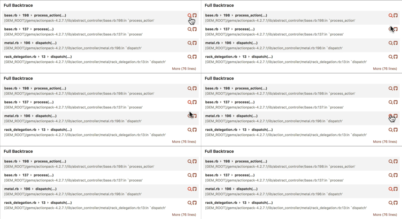
Note: You'll need to be running the latest version of the honeybadger ruby gem to get these additional snippets.
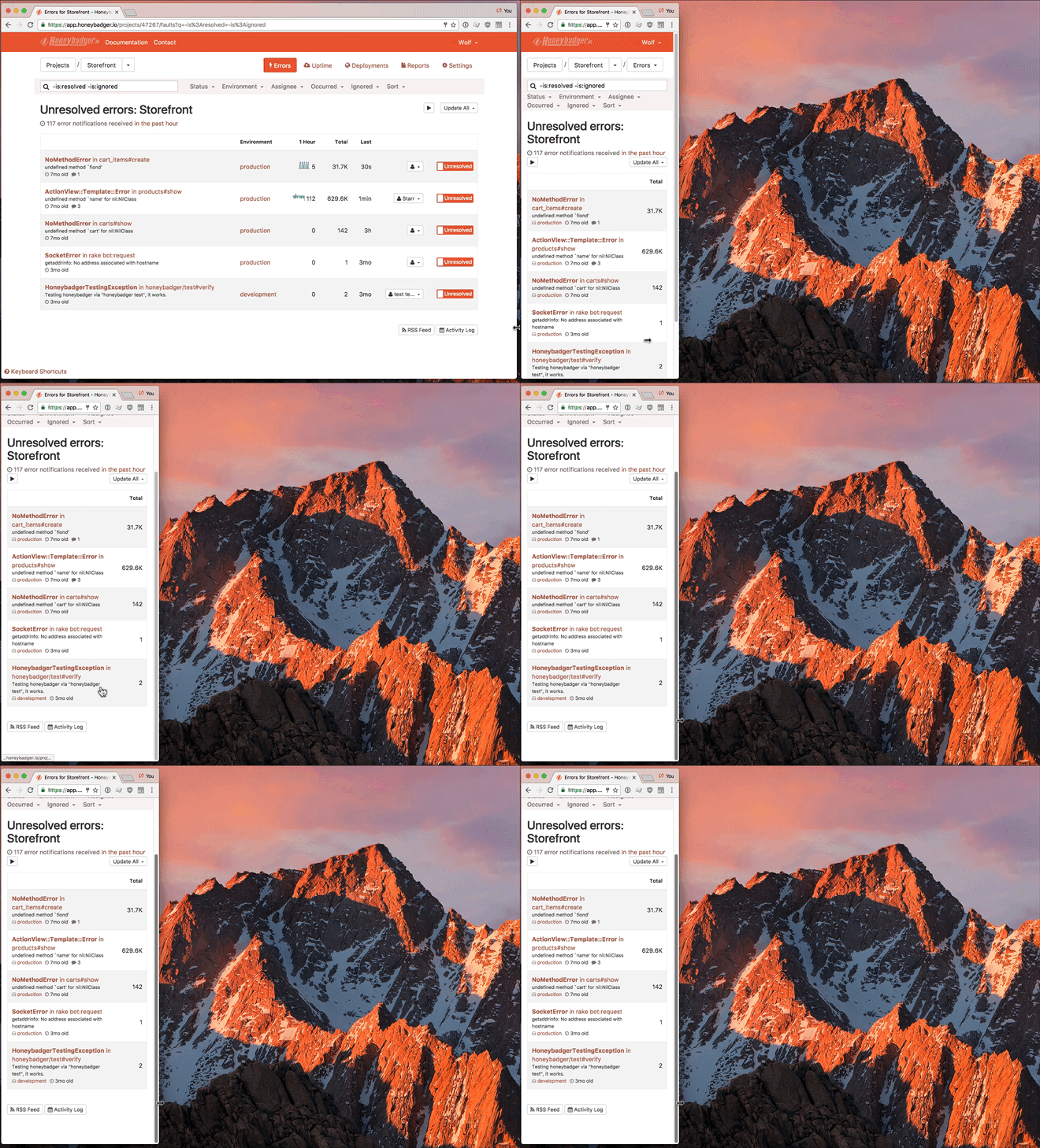
Responsive Design
The new site is fully responsive. Now it's much easier to view and respond to errors that happen when you're away from your desk.
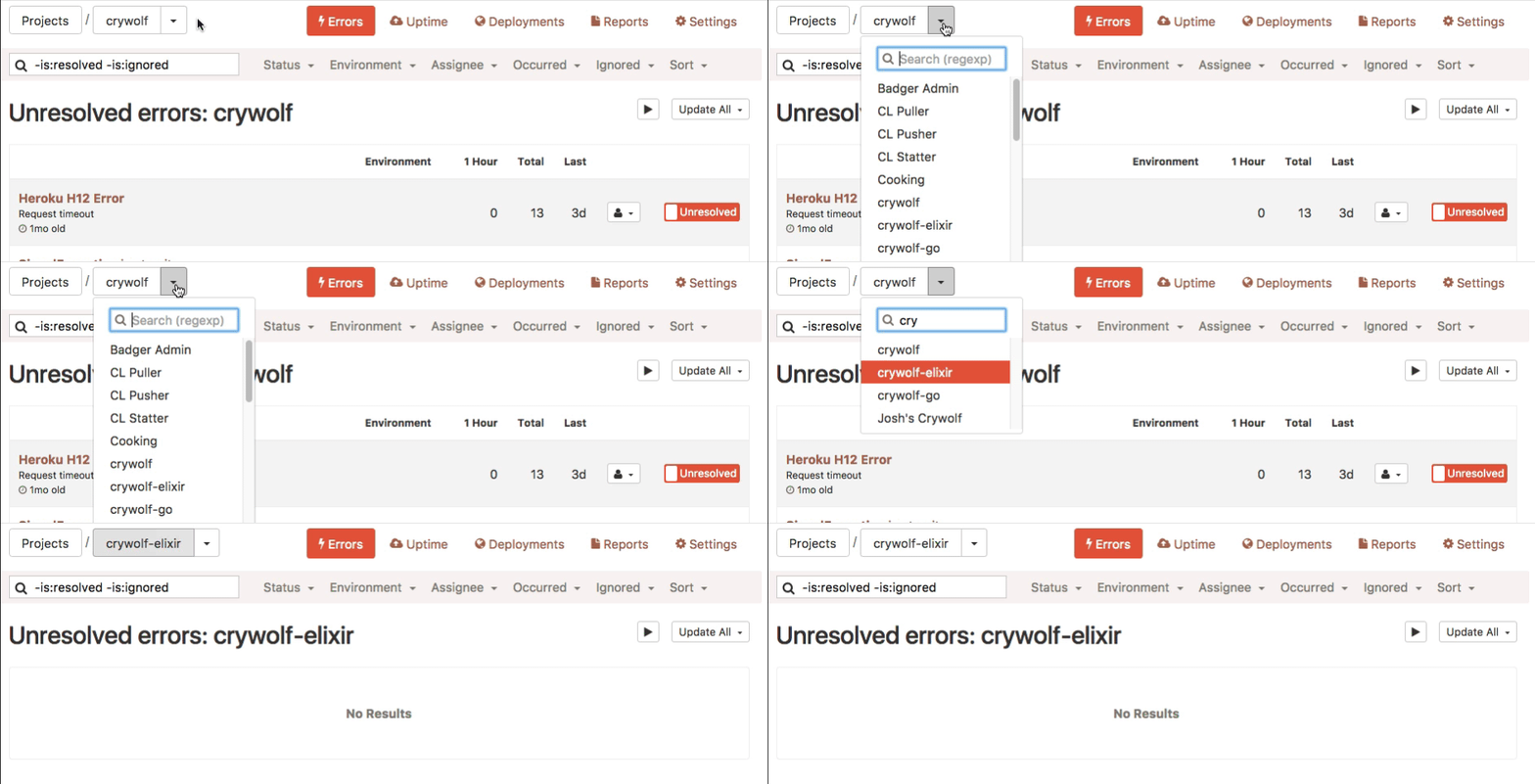
Quicker navigation between projects
Most pages now contain a project search dropdown. Prefer to use the keyboard? Press "J" (for jump), start typing your project name and hit return when there's a match.
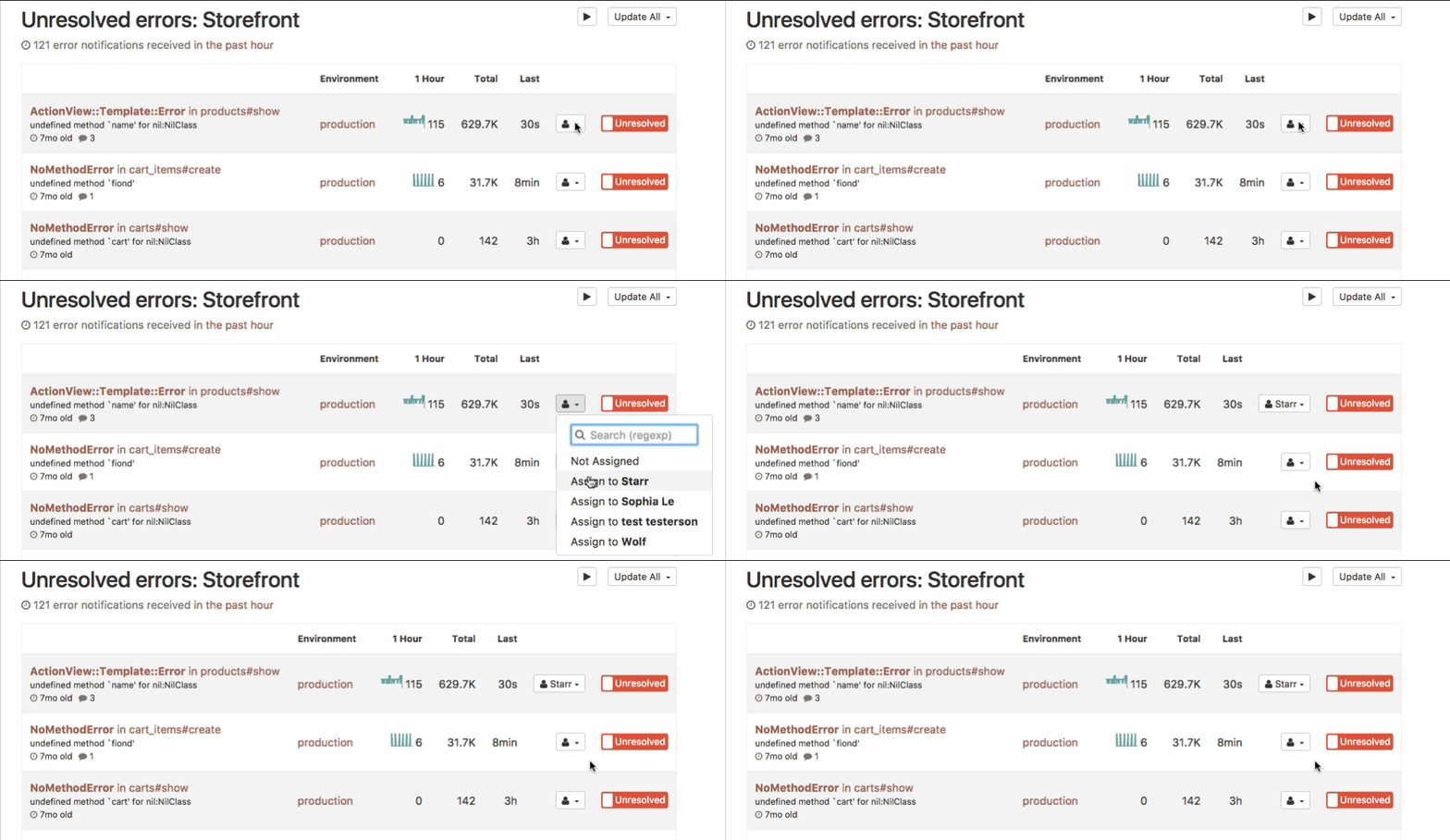
Quicker error assignment
You can now assign errors to your teammates from the error list, which is much quicker if you have several to do.
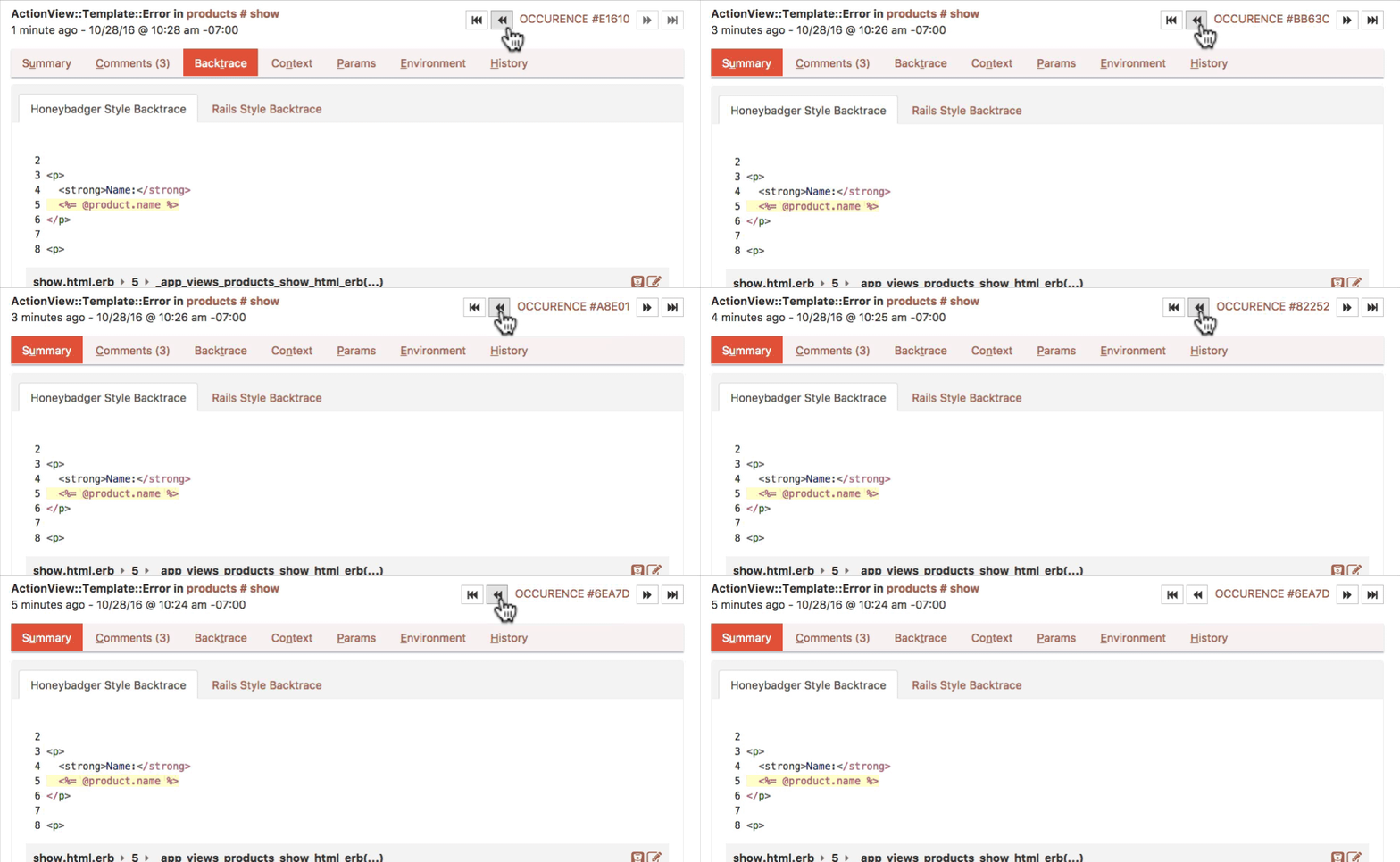
Easier navigation between fault occurrences
We've added an occurrence navbar which not only lets you flip between occurrences but also displays a summary of the occurrence being viewed.
More scannable error lists
The error list has been redesigned to make it easier to scan quickly. Instead of full timestamps, you now see relative dates. You will also see large numbers displayed in a condensed format. You can still see the exact numbers and timestamps by clicking through to the error page.

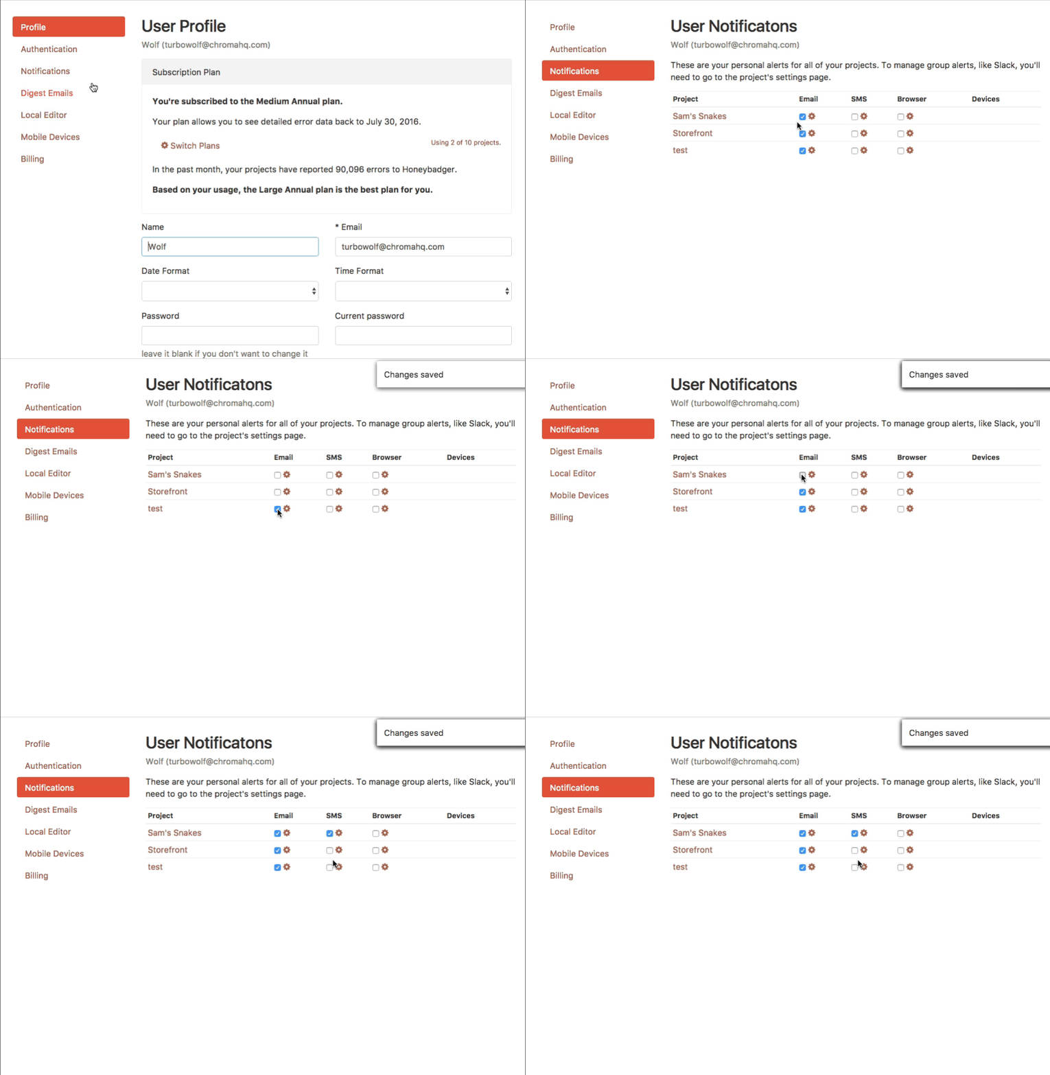
Better organized user settings
We've consolidated our scattered user setting pages, and cleaned them up quite a bit. Now, it's possible to toggle all your personal notifications in one place.
Enjoy the new changes! If you have any questions or feedback, please email us at support@honeybadger.io.

Written by
Starr HorneStarr Horne is a Rubyist and former Chief JavaScripter at Honeybadger. When she's not fixing bugs, she enjoys making furniture with traditional hand-tools, reading history and brewing beer in her garage in Seattle.